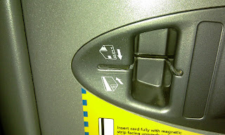
This week I used my credit card to pay for a parking meter. It seemed like a straightforward enough process – follow the prompts on the screen, insert the credit card at the right moment, and it should be done. Yet somehow, I managed to put my credit card in upside-down three times. It wasn’t until the machine cancelled my payment and I had to start again from Step 1 that I realised the mistake I was making.
Here’s the machine I was using:
I could see by the shape of the machine that the strip on my card needed to go to the left. What I didn’t get right was that the card needed to be presented strip-side-up.
Of course, when I look at the machine now, I can see the instructions clearly enough. But in typical reader fashion, I didn’t read the text on the yellow sticker that told me which way to put in the card. I was in a hurry to get to a meeting, and a bit distracted by the time it had taken me to find somewhere to park. So instead of reading, I looked quickly at the symbols and inserted my card. I’m so used to inserting my card strip-side-down in ATMs, that I assumed the same protocol would apply here. And it took three tries, with the machine saying that my card was unreadable, for me to realise my error.
In a situation like this, what else could the designer have done? There’s a simple explanation on the yellow sticker that will work for anyone who takes the time to read. But most people don’t read this type of explanation!
And the pictographs need to be understood in three dimensional space before they can make sense. I think that’s where my error occurred. When I look at the pictograph now, I can see quite clearly what it’s asking me to do. But when I was parking, I couldn’t. I wonder whether the words ‘strip side up’, right next to the pictograph, would have made a difference?


