I find that most payment systems require me to stop, concentrate, and think.
No two machines seem to work in quite the same way, so I need to focus on which button to use to select the right account, which way to insert my card, and when to enter my PIN.
When I borrowed a DVD from a machine this week, I had great trouble figuring out which way to swipe my card. It was yet another reminder that we don’t really have a satisfactory way of pictorially representing the card’s orientation.
The machine made it look easy: stripe to the left, and swipe through the machine.
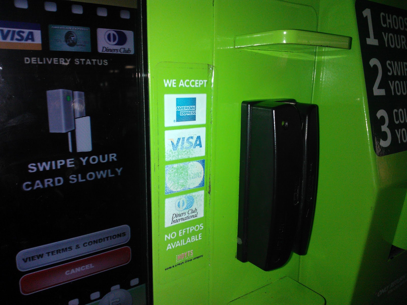
But nothing happened.
I followed the instructions multiple times. Still nothing. I cleaned my card. Nothing. I exited from the system and tried again. Nothing.
Then I had the brainwave: try the card the opposite way. Of course, it worked first time.
So why would the instructions so clearly show the magnetic strip on the left, when really the machine wants the magnetic strip on the right? Surely there’s some way to develop a screen icon that can make the orientation of the magnetic strip clear?
For me as a consumer, the problem is that the machine makes me feel inadequate or silly … particularly when there are people behind me waiting to use the machine and watching me fail.