When I heard about Nick Gadd’s book ‘Death of a typographer’, I could scarcely contain my excitement. What could be better than a detective novel where the main character solves typographic crimes?

This isn’t a review of the novel itself, which I found to be a light-hearted, easy read even if some of the typographic content seemed a little self-conscious. Once I realised that I shouldn’t take the novel too seriously, I enjoyed being taken for a typographic ride.
But I found the novel’s design made reading a chore, and I’m interested in looking at why. It’s a painful irony that a book focused on typography would have a typographic design that makes it a tough read. I struggled through its 300 pages (though, unlike the main character, I’m not precious enough to get a migraine from such things).
This book breaks four simple conventions of book design.
1. Paragraph breaks
Most books either have paragraph indents or space between paragraphs, not both. Every style manual I’ve ever read specifically warns designers against combining space with indents, because it creates too big an interruption for readers. In novels, paragraph indents are most common, because they’re thought to create minimal interruption. In business documents and non-fiction, spaced paragraphs are more common, particularly if the paragraphs are short. ‘Death of a typographer’ uses both, which simply looks weird.
2. Paragraph indents
Most paragraph indents are around one em, sometimes a little more, with the size of the indent proportional to the size of the type. This book uses a tiny paragraph indent, which for me creates an uncomfortably ragged left margin.
3. Line length
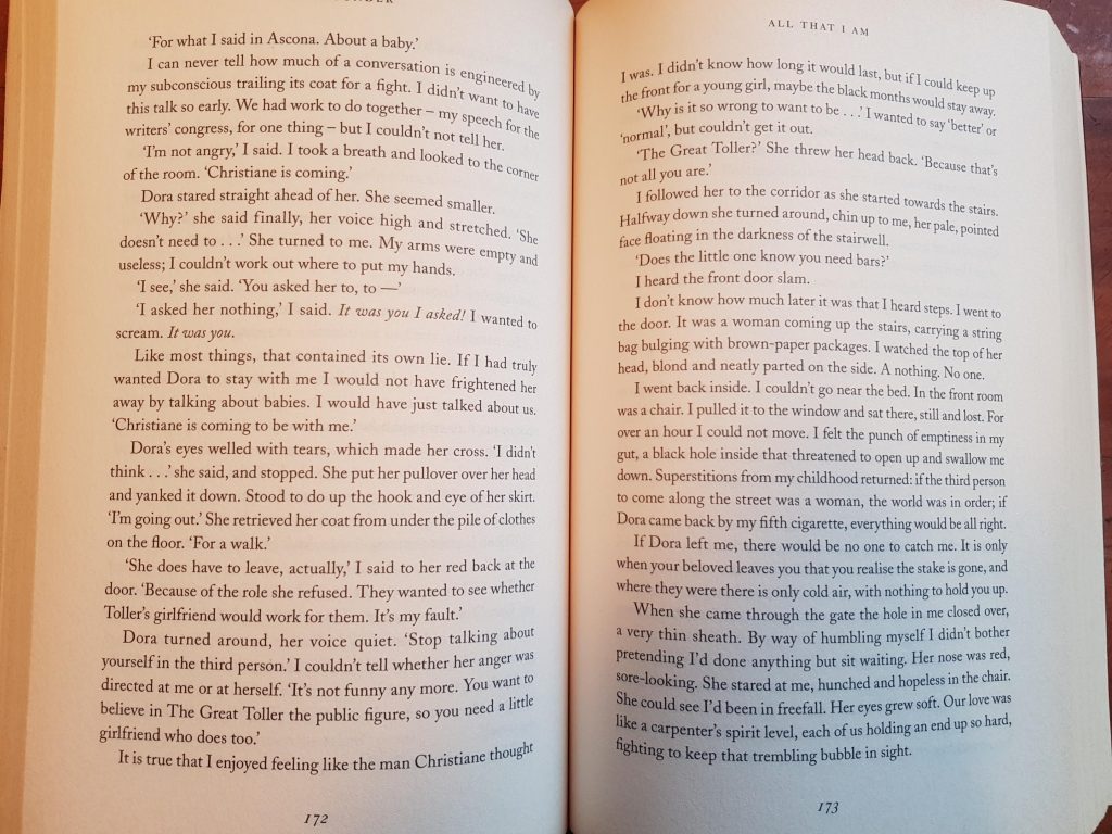
Design convention suggests that 70 characters creates the maximum line length for comfortable reading. Anything longer than 70 characters, and you run the risk of the reader getting lost as their eye tracks to the beginning of the next line. If you find yourself skipping lines of text or reading a single line multiple times, that’s often because the line length is too long. ‘Death of a typographer’ uses a line length of around 76 characters, with around 14 words per line. It’s only a little beyond the recommended maximum, but for me it was enough to make reading uncomfortable. My comparison book in the photo below, ‘All that I am’ by Anna Funder, has a line length in the mid 60s, which creates a much easier reading experience.
4. Widows and orphans
Most type designers try to avoid widows and orphans – those lonely single lines of text that get separated from their paragraph, either to be stuck at the top of a page (widows) or the bottom of a page (orphans). Widows and orphans are hard to avoid in books with short paragraphs, like ‘Death of a typographer’. Getting rid of them all might have been impossible, and the design does use a floating base line to minimise them. But the few that slipped through were, for me, like nails on a chalk board.

That’s enough of my complaints about the typography, but there’s one more thing I need to get off my chest.
Towards the end of the book, the main character is madly designing a new font. The text reads: ‘He worked fast, occasionally exchanging a few words with Roman; a cafettiere of inky-black coffee bubbled perpetually on the stove; a triple album by I Am A Dolphin unleashed its mind-bending melodies.’
Sorry, no. A cafetiere (standard spelling – just one ‘t’) is a French press. It never bubbles on the stove.
And doesn’t that set your teeth on edge, writers? Little mistakes like the cafetiere are easy to make – I know I make them all the time – and readers are not forgiving.
So, do I recommend ‘Death of a typographer’? If you can stand the layout, you like reading about typography, and you’re looking for something light to read, then yes, it’s worth the effort. But if you make your coffee in a cafetiere, remember to wait just four or five minutes before pressing.